Color is a direct reflection of personality.
You want to choose a palette that makes you feel happy in every room. Because it is so personal, though, picking the right shade can be a real stumbling block; it’s easy to hesitate and not express yourself fully.
But we say … go for it!
The safest way to start thinking about color is to choose a palette from either the Warm Family (reds, yellows, oranges) or the Cool Family (blues, greens, purples). Picking a few shades within one of these two groups ensures harmony. As you get bolder, however, you can certainly start to mix warm and cool colors together: mossy green with canary yellow, crimson red with lapis blue … the options are limitless. City garden apartment for rent
If you’re a bit more adventurous with color—but still want some direction—get inspired by something you already own and love: a rug, a piece of artwork or cloth and love: a rug, a piece of artwork or clothing, even an element from nature, like an eggshell, feather, or leaf. The fact that you love it means it will sing in your home—and the fact that all these colors already exist together means they’ll work nicely in a room.

Taking the color splash
If you’re ready for a bold mix, picking shades from opposite ends of the color wheel will always be complementary. Selecting hues that appear next to each other is a subtler combination that creates interesting definition in a space.

THE 80/20 RULE
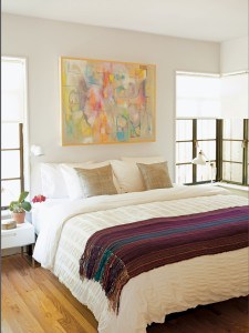
Before you get too color hungry, keep this in mind: a little bit of color goes a long way. Using whites, off-whites, and neutrals in up to 80 percent of a room, and then filling the other 20 percent with a highly saturated shade, gives you the right baseline mix. We call it the 80/20 Rule—and it’s a sure guide to getting color right in every room. You’ll find that once you start pushing color into your space, it will dramatically change the feeling of your whole home. But don’t be timid; almost nothing is permanent when it comes to home decor … especially paint.
Color schemes … with a twist
We’ve designed one palette for each of our signature styles. Don’t think of them as the only way to achieve these looks—think of them as a jumping-off point for making your own.

Warm Industrial
PRIMARY COLOR: fern green
ACCENT COLORS: powder blue-gray + light silver
ADVENTUROUS POP: add marigold
FLOORS: medium-tone distressed wood
FABRIC: neon pink geometric print

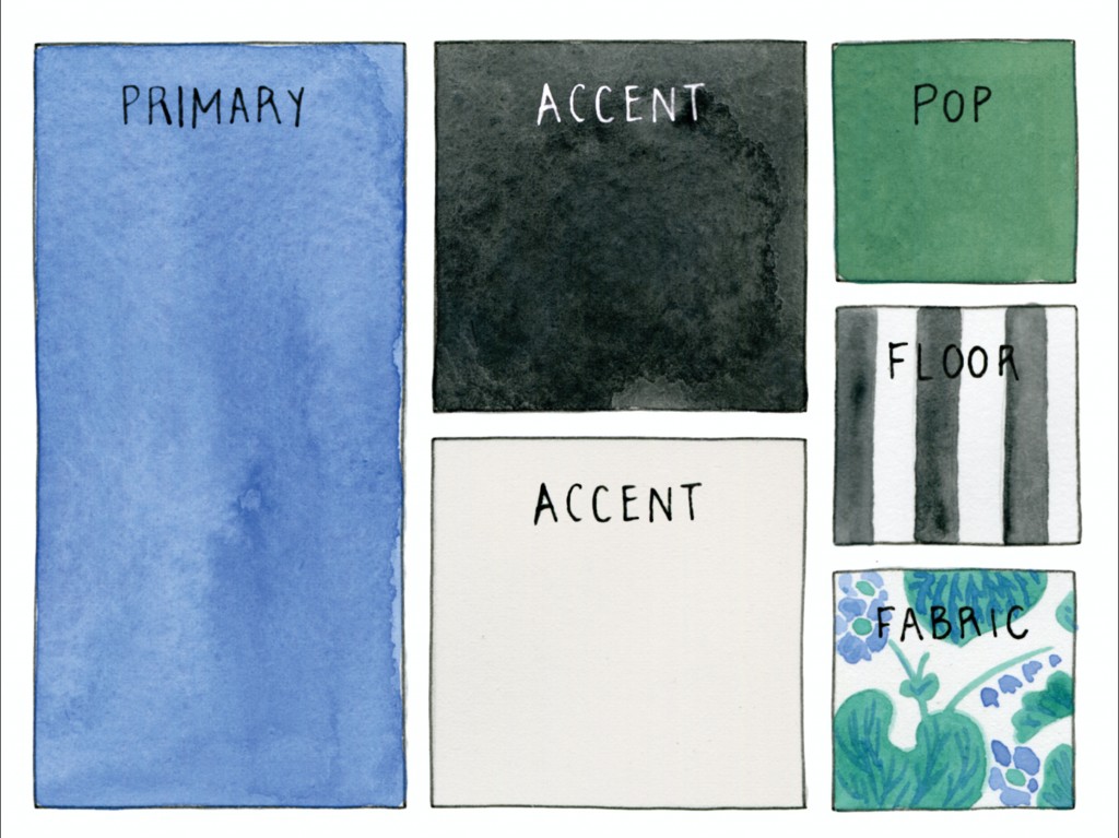
Happy Modern
PRIMARY COLOR: azure blue
ACCENT COLORS: black + eggshell
ADVENTUROUS POP: add forest green
FLOORS: textured carpet
FABRIC: bold floral print

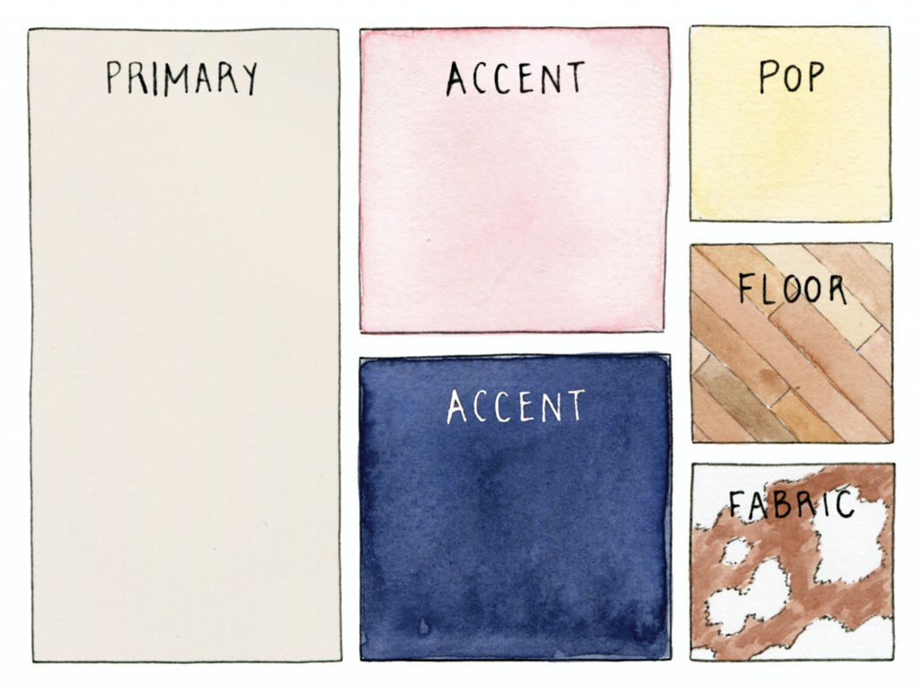
Simple Chic
PRIMARY COLOR: dutch linen
ACCENT COLORS: soft pink + deep navy
ADVENTUROUS POP: add sunglow yellow
FLOORS: honey-tone wood
FABRIC: cowhide

Eclectic Collector
PRIMARY COLOR: creamsicle orange
ACCENT COLORS: chalkboard + light yellow
ADVENTUROUS POP: add fuchsia
FLOORS: distressed cement
FABRIC: textured berber

Classic Glam
PRIMARY COLOR: gray
ACCENT COLORS: purple + olive
ADVENTUROUS POP: add tomato red
FLOORS: black wood
FABRIC: faded persian textile

Contemporary Cottage
PRIMARY COLOR: saddle suede
ACCENT COLORS: gray + ink
ADVENTUROUS POP: add kelly green
FLOORS: moroccan rug
FABRIC: rustic stripe

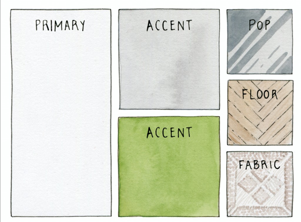
Organic Modern
PRIMARY COLOR: white
ACCENT COLORS: pale gray + moss green
ADVENTUROUS POP: add silver
FLOORS: pale wood in herringbone pattern
FABRIC: french crochet

New Traditional
ACCENT COLORS: chocolate + rich green
ADVENTUROUS POP: add ruby red
FLOORS: graphic patterned rug in a neutral shade
FABRIC: neutral check
PRIMARY COLOR: subdued sea foam

