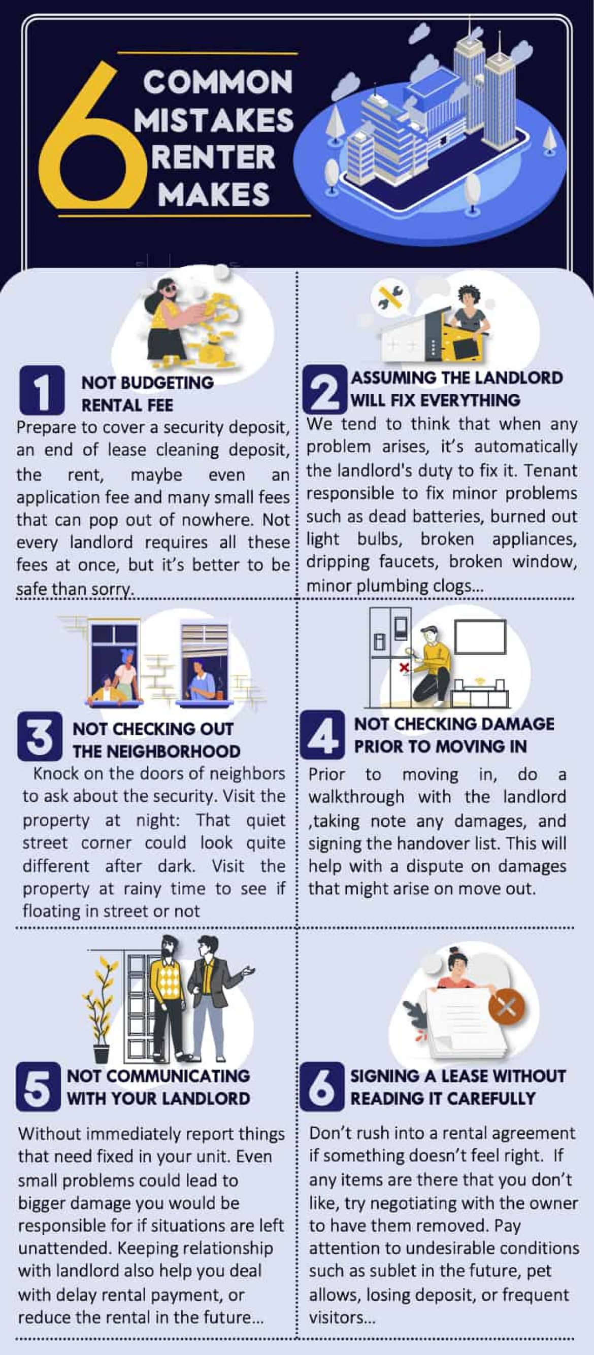
Leasing accommodation is an option that many people choose when they do not have enough financial budget to buy a house or do not have the need to settle down in an area. To rent the right property, make sure you do not make the following 6 mistakes:
Leasing accommodation is an option that many people choose when they do not have enough financial budget to buy a house or do not have the need to settle down in an area. To rent the right property, make sure you do not make the following 6 mistakes:
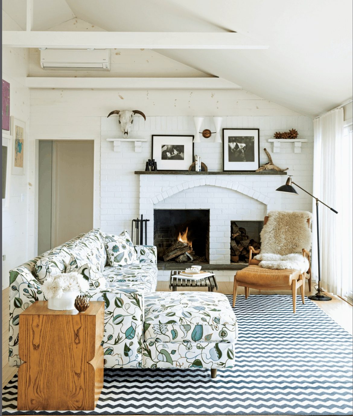
You want to choose a palette that makes you feel happy in every room. Because it is so personal, though, picking the right shade can be a real stumbling block; it’s easy to hesitate and not express yourself fully. But we say … go for it! The safest way to start thinking about color is to choose a palette from either the Warm Family (reds, yellows, oranges) or the Cool Family (blues, greens, purples). Picking a few shades within one of these two groups ensures harmony. As you get bolder, however, you can certainly start to mix warm and cool colors together: mossy green with canary yellow, crimson red with lapis blue … the options are limitless. City garden apartment for rent If you’re a bit more adventurous with color—but still want some direction—get inspired by something you already own and love: a rug, a piece of artwork or cloth and love: a rug, a piece of artwork or clothing, even an element from nature, like an eggshell, feather, or leaf. The fact that you love it means it will sing in your home—and the fact that all these colors already exist together means they’ll work nicely in a room.
Taking the color splash
If you’re ready for a bold mix, picking shades from opposite ends of the color wheel will always be complementary. Selecting hues that appear next to each other is a subtler combination that creates interesting definition in a space.
THE 80/20 RULE
Before you get too color hungry, keep this in mind: a little bit of color goes a long way. Using whites, off-whites, and neutrals in up to 80 percent of a room, and then filling the other 20 percent with a highly saturated shade, gives you the right baseline mix. We call it the 80/20 Rule—and it’s a sure guide to getting color right in every room. You’ll find that once you start pushing color into your space, it will dramatically change the feeling of your whole home. But don’t be timid; almost nothing is permanent when it comes to home decor … especially paint.
Color schemes … with a twist
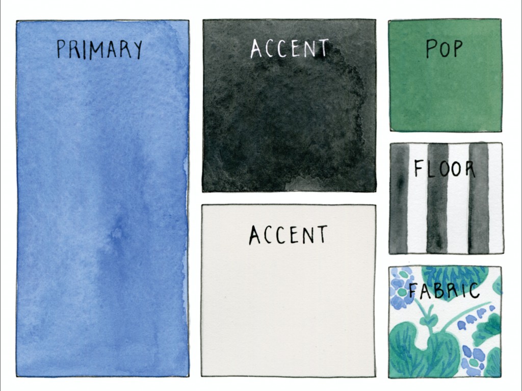
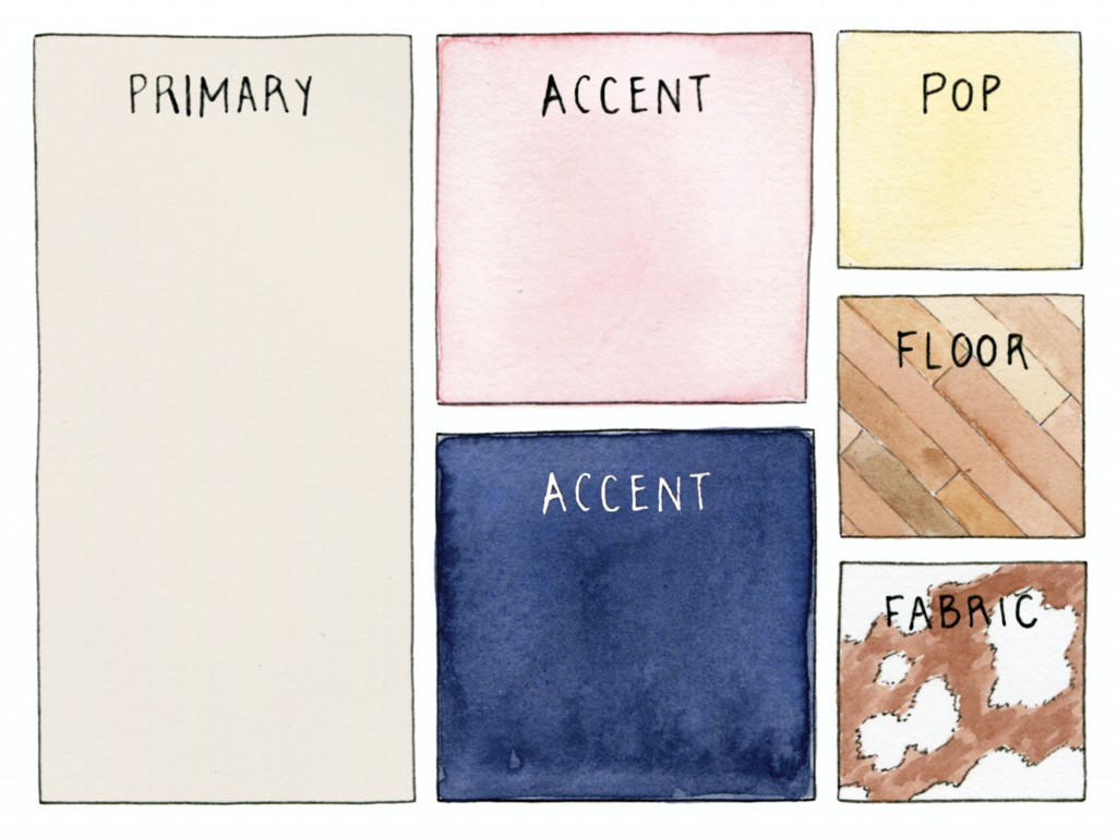
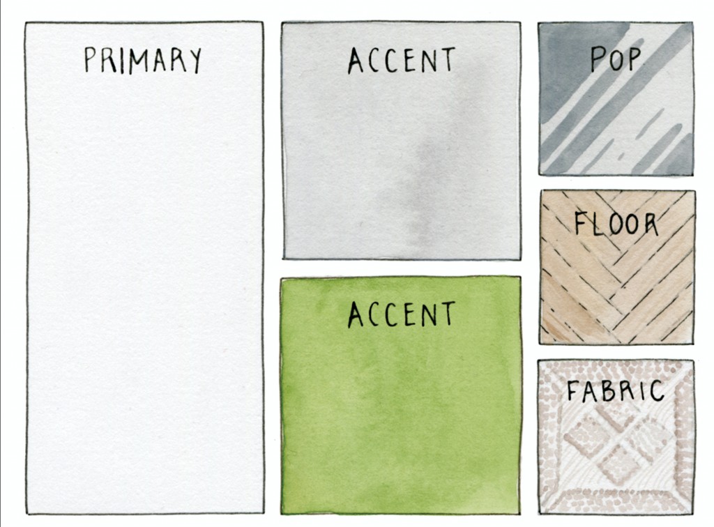
We’ve designed one palette for each of our signature styles. Don’t think of them as the only way to achieve these looks—think of them as a jumping-off point for making your own.
What is your favorite interior style? Style is often hard to label—and it’s going to be something you’re constantly discovering. So when you start thinking about style in your home, never look at it as something that’s “fixed.” Enjoy shifting, tweaking, and experimenting with every room. Read more
Drawn from feng shui (China) and Vastu-sastra (India), flow refers to the way rooms allow people and energy to move in and around them. When a room is laid out well, it not only works better, looks good, and is easy to maintain; it is also more energetic. To put it more succinctly: it will make you happy.
“Flow is the biggest secret to creating a healthy, beautiful home.”